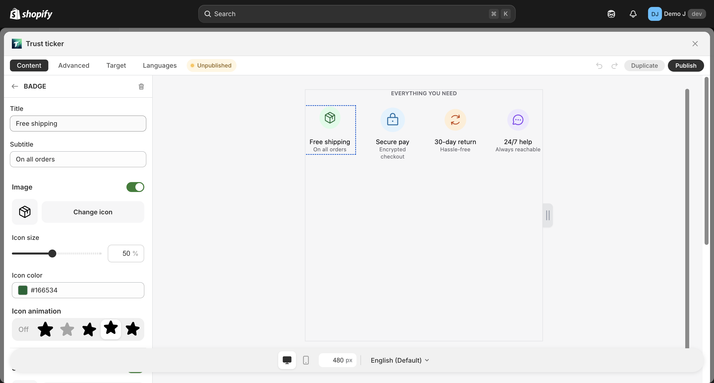
Badge
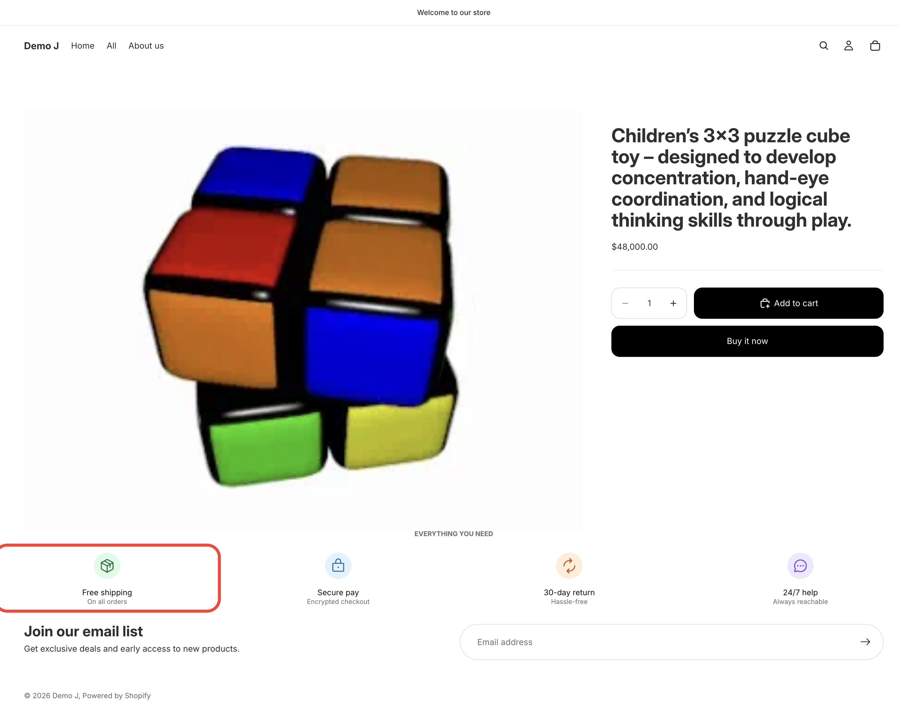
Badge (type: badge, display name “Badge”). Often used on product pages to highlight selling points, certifications, warranty info, etc. Can be used standalone or inside a Badge list container.
Fields
Section titled “Fields”- Title — main title
- Subtitle — subtitle
Image (toggle on)
Section titled “Image (toggle on)”Icon picker (tabs: Icons / Brand / Payment / Shapes / URL) + the following controls:
- Icon size — slider 10–100%
- Color
- Hover animation
Icon variants:
- Shape weights: Regular / Thin / Filled / Duotone
- Brand variants: Color / Mono
Shape (toggle on, only when Image is on)
Section titled “Shape (toggle on, only when Image is on)”Shape picker + the following controls:
- Color
- Hover animation
- Border: color / opacity / width
Popover (toggle on)
Section titled “Popover (toggle on)”- Trigger: Click / Hover
- Popover title (placeholder “Enter your title”)
- Popover description — multi-line (placeholder “Enter your description”)
- Popover link text + Popover link URL