Group
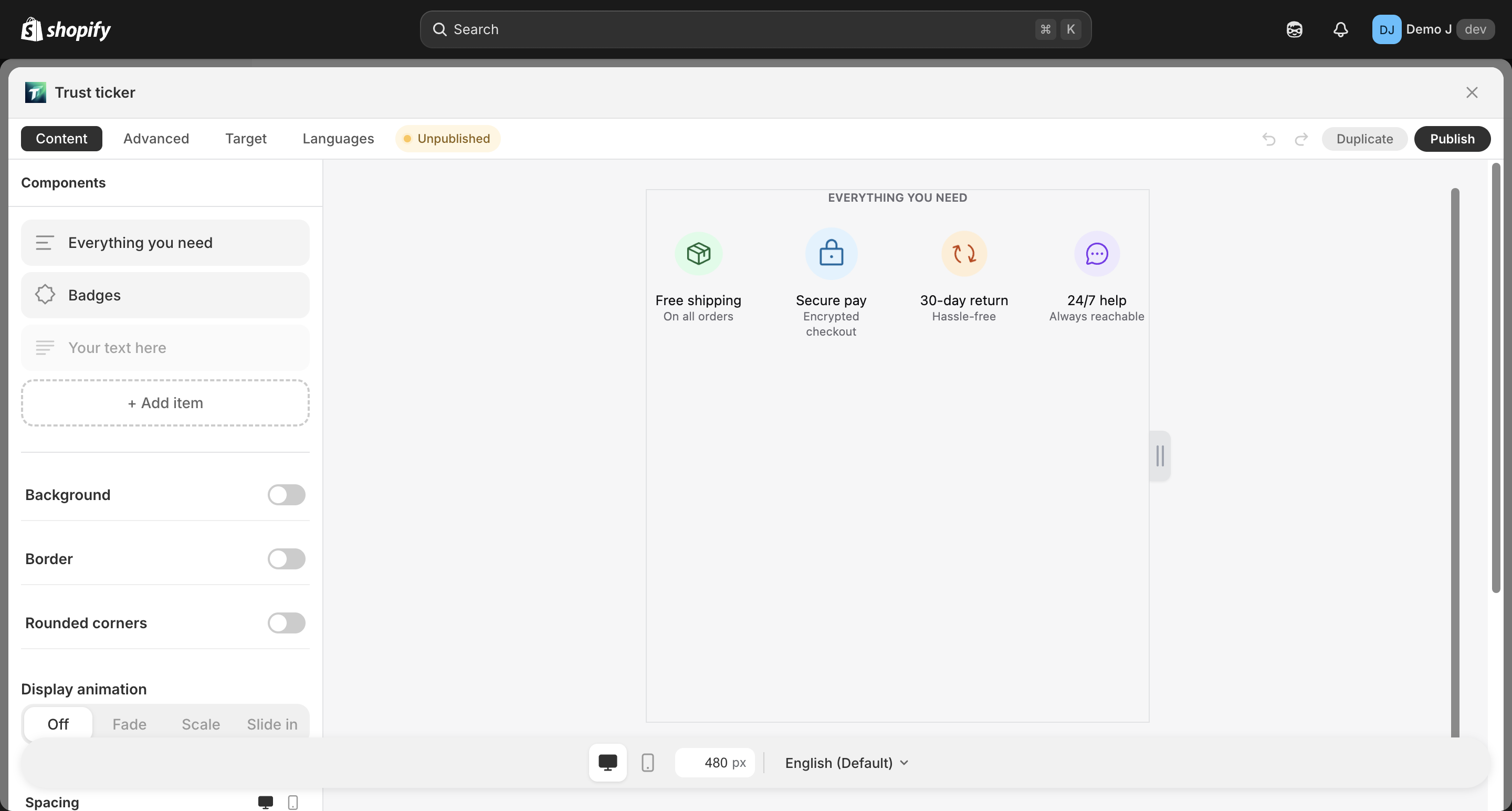
Group (type: group, display name “Group”) is a generic container component that wraps heterogeneous children into one visual unit with unified layout and styling.
Difference from specialized containers (badge_list / button_list / brand_icons / payment_icons):
| Container | Child type restriction | Typical scenario |
|---|---|---|
group | Any mix | Combine a heading + a row of badges + a line of text into one visual unit |
badge_list | Only badge | Multiple badges in a row |
button_list | Only button | Multiple buttons in a row |
brand_icons | Only brand_icon | Multiple brand icons in a row |
payment_icons | Only payment icon | Multiple payment method icons in a row |
Fields
Section titled “Fields”Container layout
Section titled “Container layout”- Direction — Horizontal / Vertical
- Justify — Start / Center / End / Space between / Space around
- For column direction also: cross-axis align — Left / Center / Right / Stretch
- Gap — child spacing 0–80
Card mode (toggle)
Section titled “Card mode (toggle)”Wrap each child in a card style:
- Card background / Card border / Card radius / Card padding
- Hover animation
- Padding — responsive
{mobile, desktop}