Apply theme colors to blocks
Make blocks visually consistent with your storefront: the app can read your published theme’s colors and offer them as an extra color scheme inside the Advanced tab.
Tip: “Theme palette derivation needs an OS 2.0 theme.”
1. Open the Advanced tab
Section titled “1. Open the Advanced tab”Open the block editor → Advanced tab → “Color scheme” card.
2. Find “From your theme”
Section titled “2. Find “From your theme””In the color scheme picker, scroll to the “From your theme” group.
Theme-derived schemes are named “Theme {n}” or “{themeName} Theme {n}”.
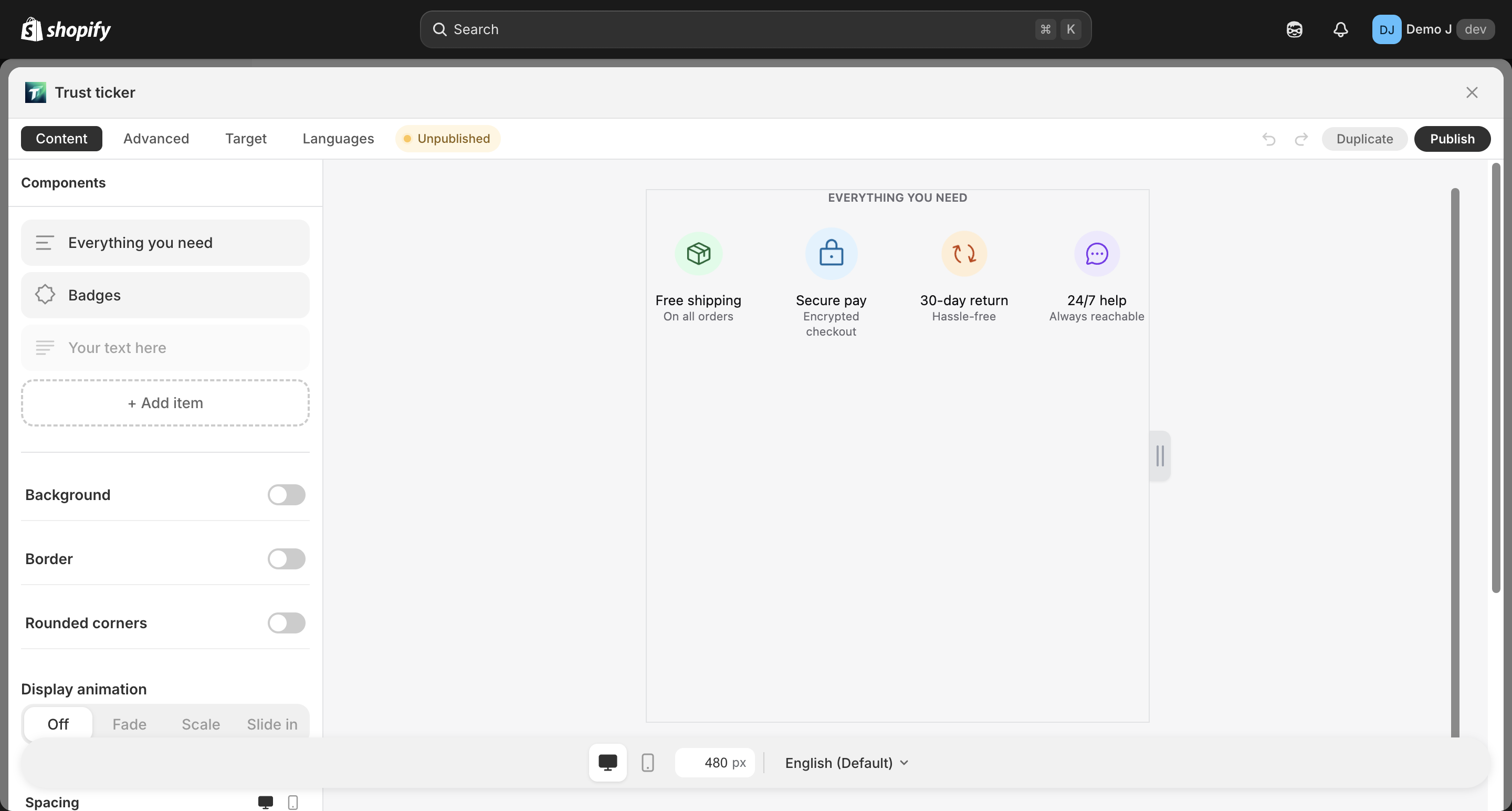
3. Apply
Section titled “3. Apply”Click a scheme card to apply it to the current block.
4. When derivation fails
Section titled “4. When derivation fails”If the “From your theme” group is missing, your theme is not supported. Common reasons:
| Reason | What to do |
|---|---|
| Theme is Vintage (e.g. Brooklyn) | Pick one of the 4 built-in schemes from the Advanced tab |
| Theme doesn’t expose enough color settings | Use a built-in scheme, or contact the theme author |
Empty state: “No theme palette detected — pick a curated scheme below.”
What happens when you switch themes?
Section titled “What happens when you switch themes?”Existing blocks are unaffected. Each block keeps the colors and icon style it had at creation time — switching the storefront theme does not retroactively restyle published blocks.
After switching, when you reopen a block:
- The Advanced tab will show schemes derived from the new theme
- Applying one is an explicit choice — nothing changes automatically
- Typography follows the new theme; shape stays as-is
Built-in schemes vs theme-derived
Section titled “Built-in schemes vs theme-derived”| Source | When to pick |
|---|---|
| 4 built-in schemes (Plain Color / Plain Mono / Brand on White / Brand Fill) | You want a pre-designed look, or your theme isn’t supported |
| Theme-derived | You want blocks to fuse with the storefront theme’s existing palette |
Different blocks can use different schemes; one block uses one scheme at a time.
Brand color exception
Section titled “Brand color exception”Some components (brand icons like Amazon orange, Instagram pink) have built-in brand colors. Color scheme changes do not override brand-color fields — those are part of brand recognition.
If you want brand icons to follow the scheme color instead, switch the brand icon’s variant to Mono.