Editor overview
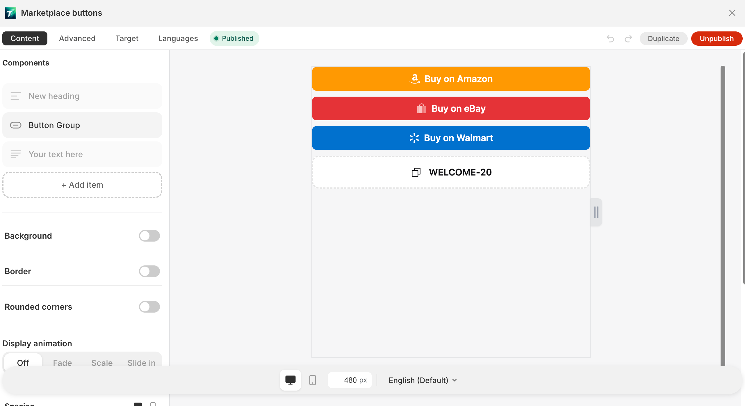
Click a block card or list row on the home page to enter the editor — the main workspace for a single block.
Overall layout
Section titled “Overall layout”- Left: 4 tabs + field panel
- Right: live preview canvas
- A draggable splitter in between adjusts column widths
4 tabs
Section titled “4 tabs”| Tab | Purpose | Details |
|---|---|---|
| Content | Edit block component tree and fields | Content tab |
| Design | Color scheme (Bundle) / Custom CSS / Delete | Advanced tab |
| Display | 9-dimension display rules | Target tab |
| Localization | Multi-language text | Languages tab |
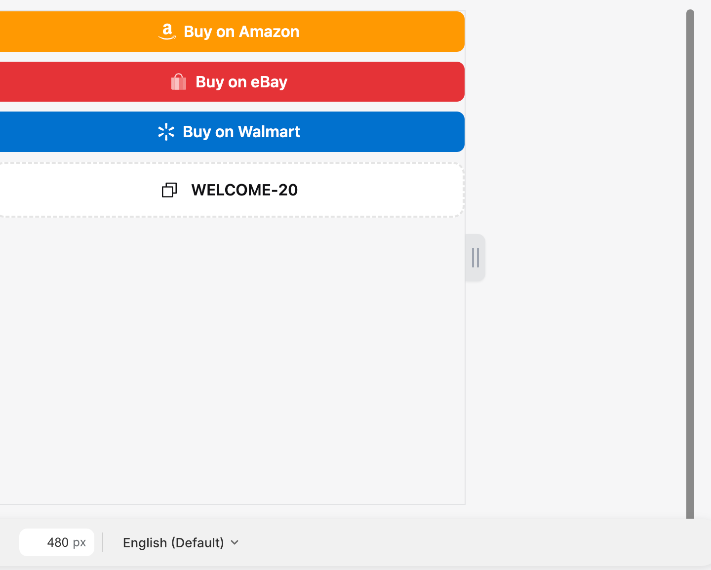
Live preview canvas
Section titled “Live preview canvas”Render mechanism
Section titled “Render mechanism”The preview canvas is an iframe loading the same widget.js used by the storefront. When merchants edit fields, postMessage pushes config to the iframe; Preact diff-updates inside.
Critical constraint: admin preview = storefront rendering (by construction) — widget.js is a config → DOM pure function; admin and storefront share the same code, so what merchants see in the editor is what ships.
Desktop / mobile toggle (viewMode)
Section titled “Desktop / mobile toggle (viewMode)”Bottom toolbar’s desktop / mobile toggle buttons:
- Desktop — canvas renders desktop fields (e.g.
desktopSize/desktoppadding values) - Mobile — canvas renders mobile fields (
mobileSize/mobilepadding)
Mechanism:
- viewMode is sent to the iframe via postMessage
- WidgetRenderer uses
isMobilecontext to decide which CSS each component outputs - Does not depend on iframe actual width (avoiding preview iframe size ≠ real device inconsistency)
Production storefront: real @media (max-width: 768px) query.
Other canvas elements
Section titled “Other canvas elements”- “Width” displays current canvas width
- Empty state: “No components — add a component to start editing.”
Top actions
Section titled “Top actions”- Back (return to block list)
- “Undo” / “Redo” (shortcuts Cmd/Ctrl+Z / Cmd/Ctrl+Shift+Z)
- “Publish” (publishing shows “Publishing…”) / “Unpublish” (unpublishing shows “Unpublishing…”)
- “Copy ID” (tooltip: “Open this block in the theme editor and auto-add it”)
- “Add to theme”
- “Delete” (tooltip: “Deleting this block cannot be undone.”, confirm “Delete this block?”)
New blocks default to “My Block” — rename via list row’s “Rename”.

SaveBar behavior
Section titled “SaveBar behavior”Editing any field (including placement switching → SET_PLACEMENT triggered) → top “Save” SaveBar appears, prompting unsaved changes.
- “Save” — commits block config to D1 + Shopify metafield
- “Discard” — reverts to last saved version (incl. visibility and all other fields)
- Same account publishing / unpublishing in another tab → current editor’s status pill auto-refreshes (BC_MSG broadcast)
Label block special layout
Section titled “Label block special layout”Label block (Product image overlay) Content tab is a dedicated panel:
- AnchorPicker (3×3 grid) — pick chip’s position on the product image
- Single LabelChip edit panel (not a component list)
- Target tab has an extra scope segmented (PDP / Cards / Both)