Text
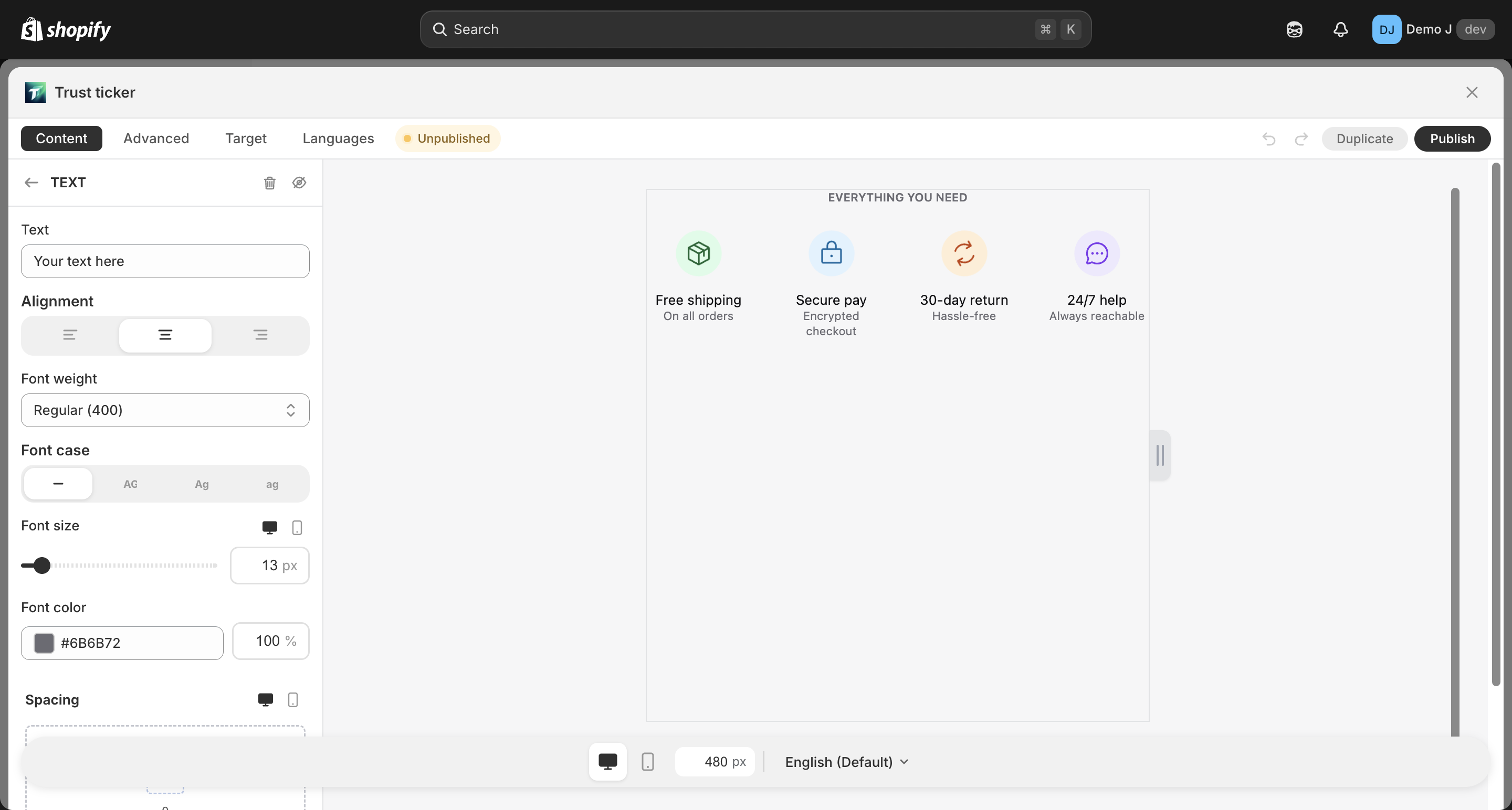
Text (type: text, display name “Text”) is a single / multi-line free-form text component, used for subtitles, supplementary descriptions, disclaimers, etc.
Fields
Section titled “Fields”Content
Section titled “Content”- Text (
label) — text content (multi-line + simple inline format supported)
Typography
Section titled “Typography”- Alignment — Left / Center / Right
- Font weight — Regular / Medium / Semibold / Bold / Extra bold / Black / Off
- Text case — Default / Uppercase / Lowercase / Capitalize
- Font size (
fontSize) — responsive 8–80px, default 14px- Desktop font size / Mobile font size independently configurable
- Line height (
lineHeight) — responsive - Font family (
fontFamily) — defaults toinherit(follows theme), merchant can explicitly specify
- Color — with opacity (RGBA / hex), default
#333333 - Background (optional) — Fill type
- Border (optional) — color / width
- Radius — only effective when background or border is enabled
Spacing
Section titled “Spacing”- Padding — responsive
{mobile, desktop} - Margin — responsive
{mobile, desktop}
Animation
Section titled “Animation”- Hover animation
Use suggestions
Section titled “Use suggestions”- Subtitle: place below Heading for supplementary description
- Disclaimer text: thin font + light color (e.g.
#666666) for auxiliary info - Multi-language: fill translations per locale in Languages tab