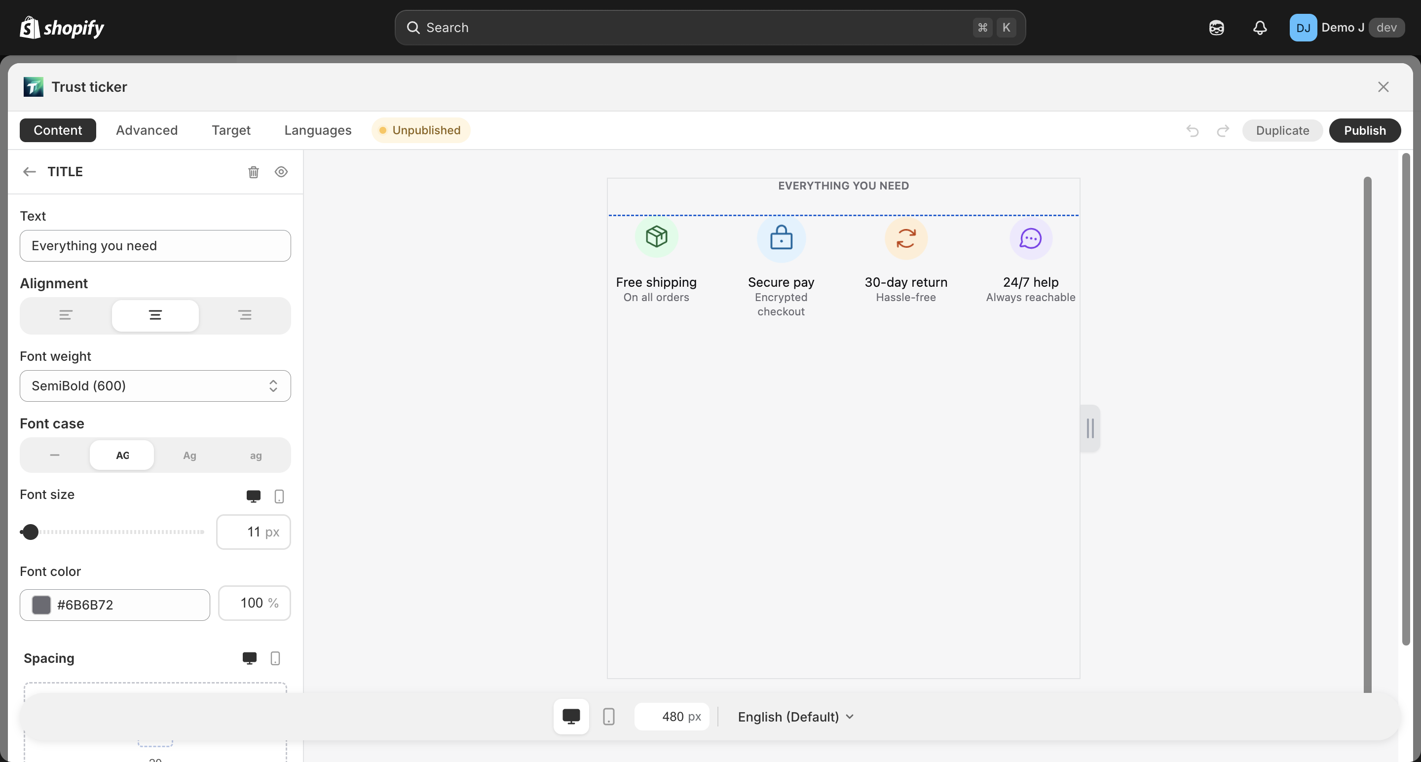
Heading
Heading (type: heading, display name “Title”) is a single-line heading text component. No margin, only padding.
Fields
Section titled “Fields”Content
Section titled “Content”- Text (
label) — heading text
Typography
Section titled “Typography”- Alignment — Left / Center / Right
- Font weight — Regular / Medium / Semibold / Bold / Extra bold / Black
- Text case — Default / Uppercase / Lowercase / Capitalize
- Font size (
fontSize) — responsive, max 72px, default 18px- Desktop font size / Mobile font size independent
- Font family (
fontFamily) — defaults toinherit(follows theme)
HTML level
Section titled “HTML level”- Level (
level) — Default (h3) / h1 / h2 / h3 / h4 / h5 / h6- Selected level affects generated HTML element (
<h1>~<h6>), affecting SEO and accessibility - Default h3 avoids conflict with theme-native h1 / h2
- Selected level affects generated HTML element (
- Color — with opacity, default
#1a1a1a - Background (optional) — Fill type
- Border (optional)
Spacing
Section titled “Spacing”- Padding — responsive
{mobile, desktop} - Heading does not provide a margin field (rely on the container or parent container margins)
Animation
Section titled “Animation”- Hover animation
Use suggestions
Section titled “Use suggestions”- Section heading: h2 / h3 + bold; keep 2-4px larger than body text
- Small chip heading: h5 / h6 + medium weight
- SEO note: each page typically should have only one h1 — block headings should avoid h1 (default h3 is reasonable)