Content tab
The “Content” tab is layered navigation: component list → container children → single child editing. Click items to drill in; back arrow returns one level.
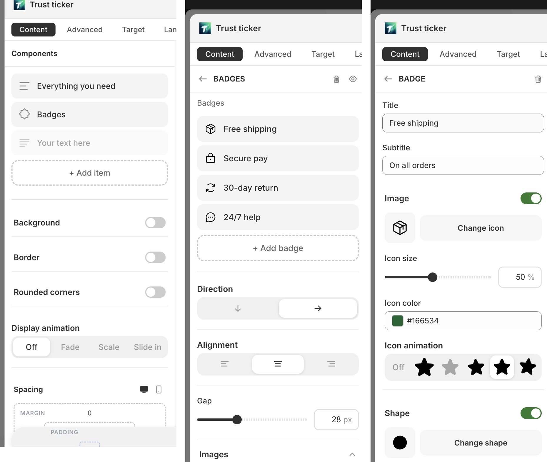
View 1: Component list (outermost)
Section titled “View 1: Component list (outermost)”The default view when opening a block — lists all top-level components.
Controls:
- Top heading: “Components”
- Component cards (drag to reorder): icon + name + “Hide” / “Show” + “Duplicate” + “Delete”
- Empty state: “No components”
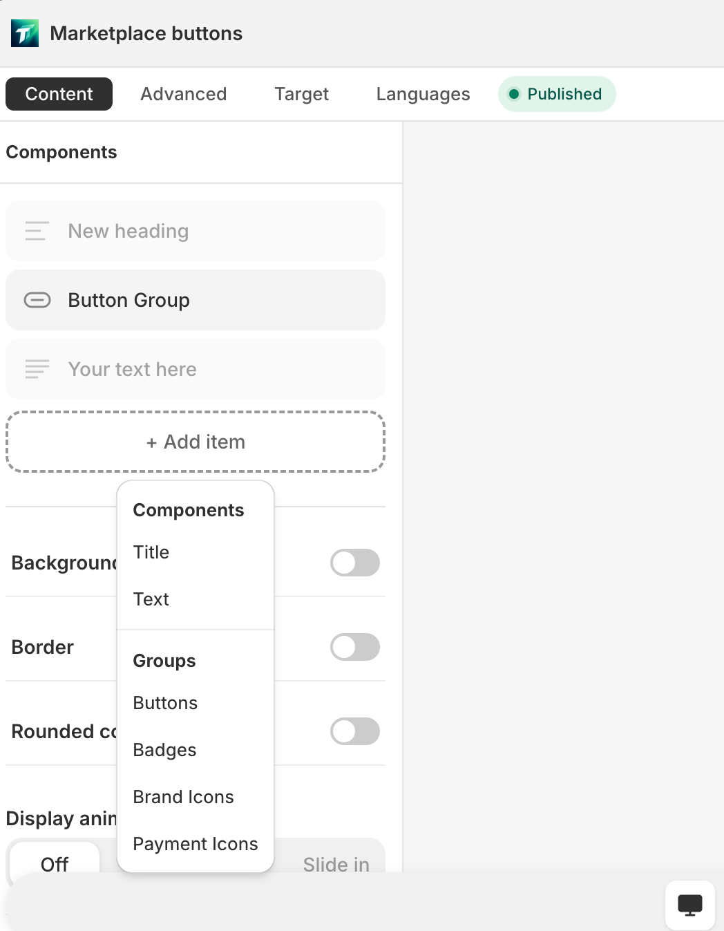
- ”+ Add item” button (dashed) → popup menu in two groups:
- “Components”: single component types (Heading / Text / Button / Coupon / Payment icons / Badge)
- “Groups”: container types (Buttons / Badges / Brand icons / Payment icons)
- Bottom Block settings: “Background” / “Padding” / “Margin” / “Radius” / “Display animation” / “Spacing”
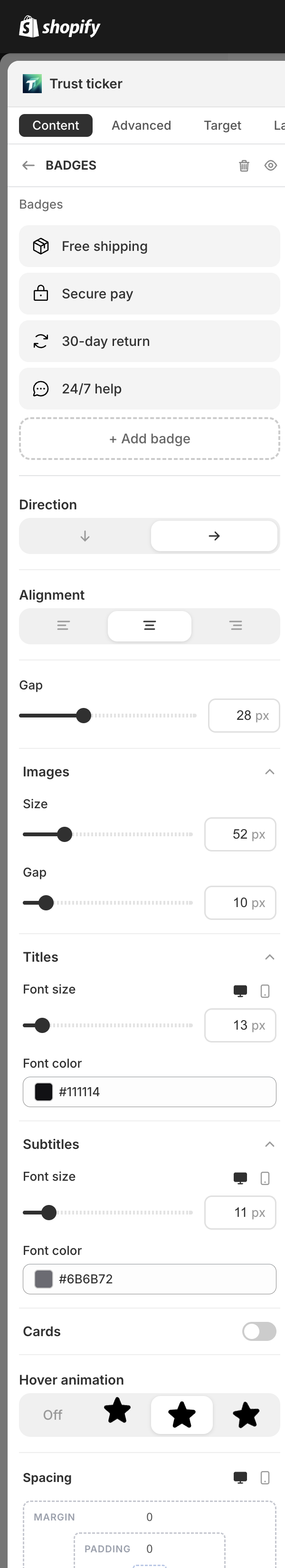
View 2: Container children
Section titled “View 2: Container children”Click a container component (Badge list / Button list / Brand icons / Payment icons) to enter.
Controls:
- Top: back + container name (uppercase) + “Hide” / “Delete”
- Container layout params (“Direction” / “Gap”, etc., per container type)
- Child cards list (draggable): icon + label + “Hide” / “Duplicate” / “Delete”
- Add buttons (per container type):
- ”+ Add badge” / ”+ Add button” / ”+ Add icon”
- Multi-type containers: cascading menu picks subtype (Button list also has “Button preset” submenu)
- Brand icons: opens icon picker to choose brand
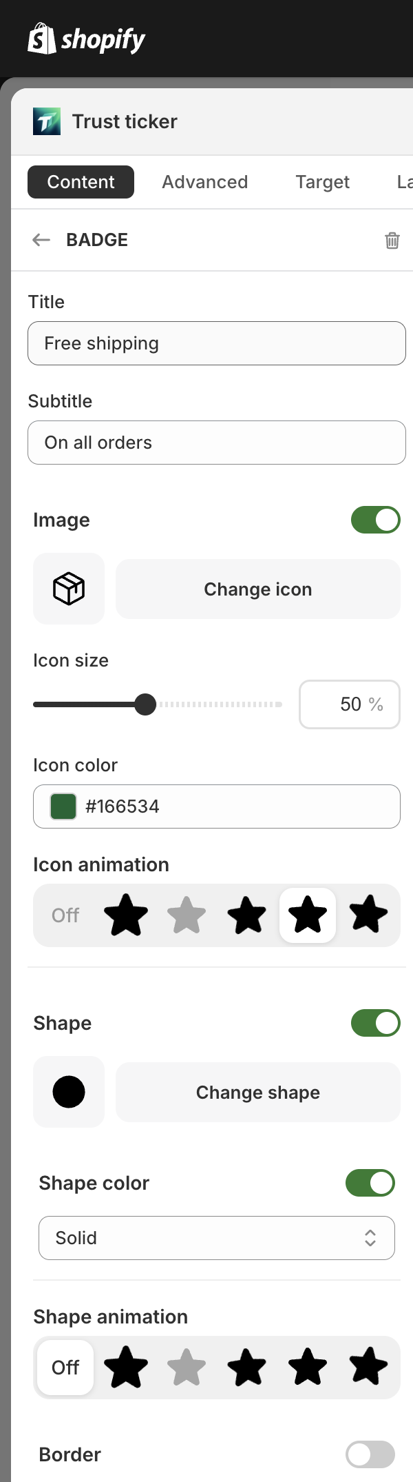
View 3: Single item editing
Section titled “View 3: Single item editing”Click a specific child to enter the field editor. Fields differ per type — see each component documentation.
Some component types without an editor display: “This component type has no editor.”