Advanced tab
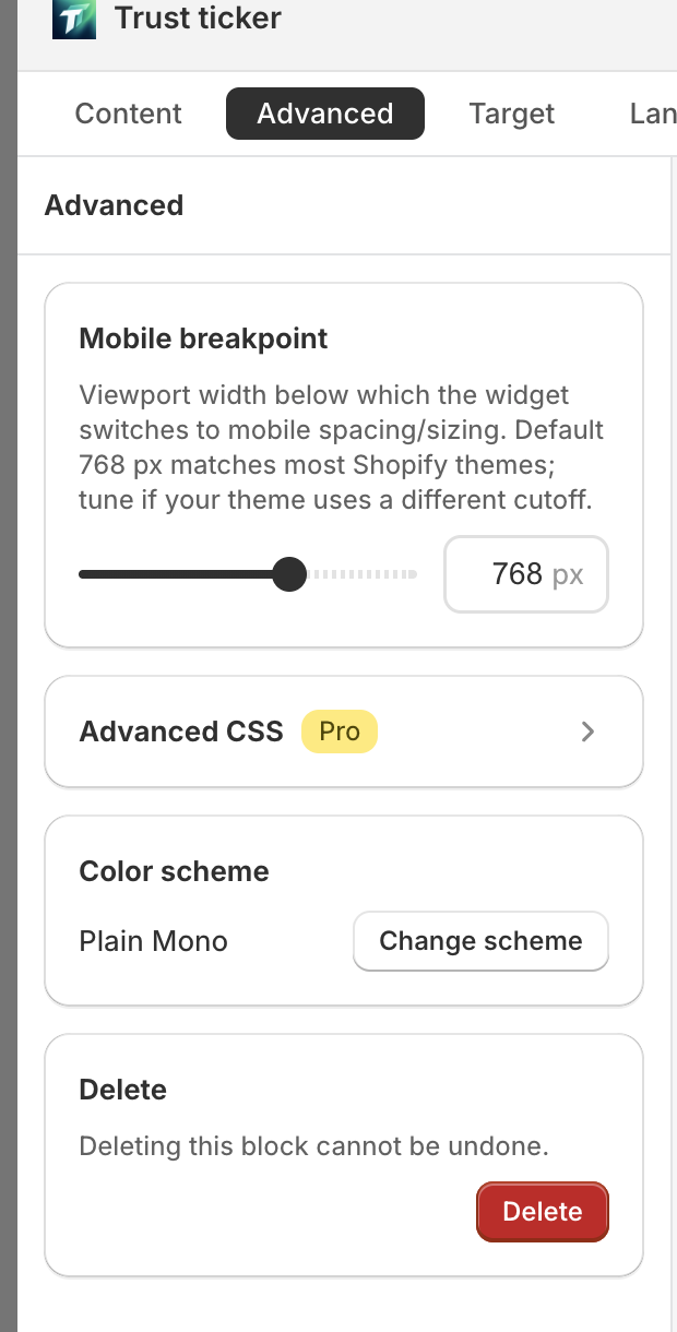
The “Advanced” tab controls a block’s overall visual style and advanced operations.
Color scheme
Section titled “Color scheme”- Card title: “Color scheme”
- Current scheme name (custom shows “Custom”)
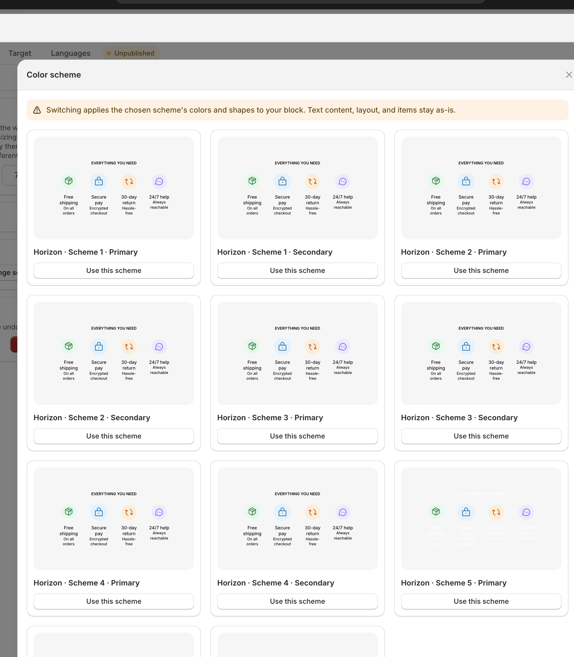
- “Change scheme” / “Pick a scheme” button → opens modal:
- Title: “Color scheme”
- Top banner: “Switching applies the chosen scheme’s colors and shapes to your block. Text content, layout, and items stay as-is.”
- 4 built-in schemes: Plain Color / Plain Mono / Brand on White / Brand Fill
- Current scheme marked “Current”, after applying shows “Applied”
When you switch a scheme, only colors and shapes change. Fields you’ve manually overridden stay as-is, and text / layout / items are never touched.
From your theme
Section titled “From your theme”Below the built-in schemes, the “From your theme” group lists schemes derived from your published storefront theme — full flow and empty-state behavior: Apply theme colors to blocks.
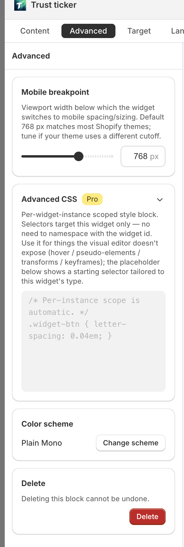
Advanced CSS (Pro)
Section titled “Advanced CSS (Pro)”- Card title: “Advanced CSS” + Pro badge
- Description: “Add custom CSS for this block and other page elements.”
- Multi-line CSS input, label “Custom CSS”
The placeholder shows a starting selector tailored to the block type, ready to copy:
| Block type | Starting selector |
|---|---|
| complex | .widget-root { /* your styles */ } |
| floating | .widget-root.floating-top { /* ... */ } |
| label | .widget-label-chip { /* ... */ } |
The hint area shows extended selector examples (hover state, sub-component level, page-specific level, etc.).
Non-Pro users see the locked state with an upgrade prompt.
Delete
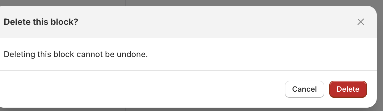
Section titled “Delete”- Card title: “Delete”
- Tip: “Deleting this block cannot be undone.”
- “Delete” button (destructive style) → confirms with “Delete this block?”
Related
Section titled “Related”- Apply your storefront theme’s colors to a block → Apply theme colors to blocks