Block creation wizard
Click “Create block” on the home page to enter the wizard. Three steps to complete, then enter the editor.
Top navigation
Section titled “Top navigation”- Title: “Create block”
- “Cancel” / “Back” buttons
- Step indicator: Placement → Template → Style, current step highlighted

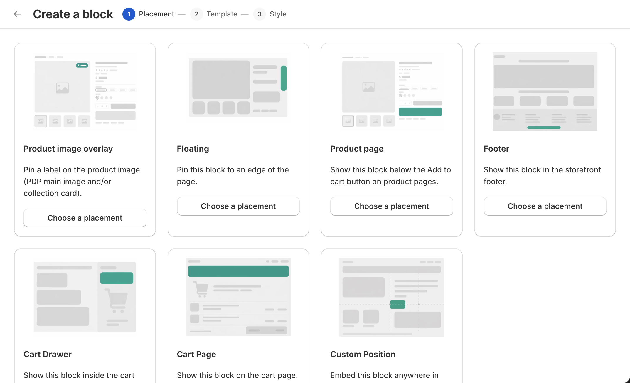
Step 1 — Placement
Section titled “Step 1 — Placement”7 same-level cards, each = one mount location. Click the card’s bottom “Pick this position” button to next step.
| Card | Tip |
|---|---|
| Product page | Display below the “Add to cart” button on the product page. |
| Footer | Display in the storefront footer. Two buttons within: “Above footer” / “Below footer”. |
| Floating | Pin at viewport edge. 4 edges within: “Top” / “Bottom” / “Left” / “Right”. |
| Cart Drawer | Display in the cart drawer. |
| Cart Page | Display on the cart page. |
| Custom Position | Embed at any theme location. |
| Product image overlay | Pin a label to product images (PDP main image or collection card image). |
Each card’s right side shows position “Preview”.
Tip: “Specific DOM position is auto-selected by the system based on theme — merchant doesn’t choose.”
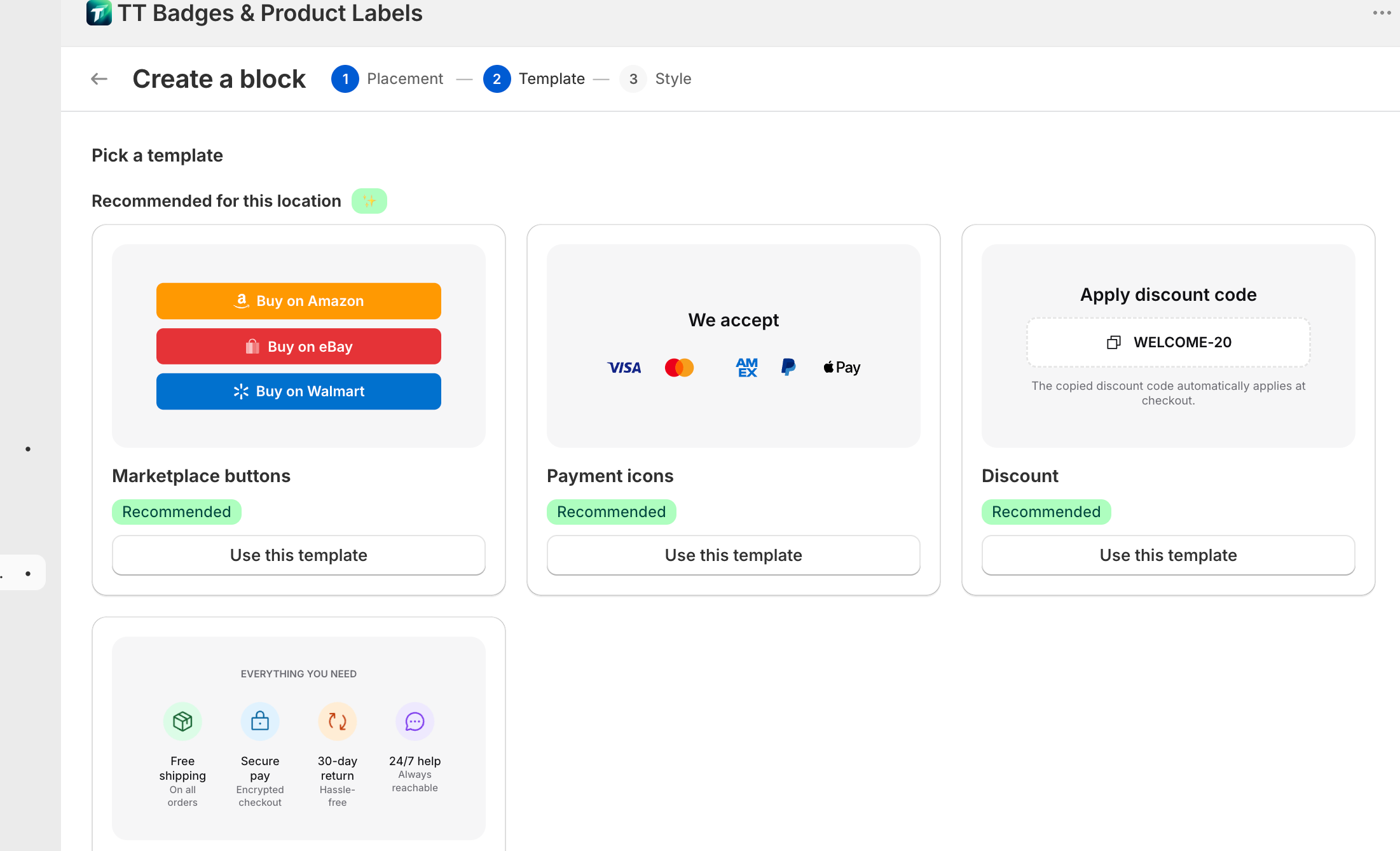
Step 2 — Template
Section titled “Step 2 — Template”Subtitle: “Pick a template”.
Lists all templates by category, with “Matches this position” at the top (recommended row, with “Recommended” badge).
Template categories:
- Buttons — marketplace / quick links / quick icons / discount
- Badges — Trust ticker / Trust mono stack
- Social — Social row / Social column / Messengers
- Payment — Payment icons / Payment mono / Trust+payment combo
- Labels — Sale / New arrivals / Low stock / Natural
Each card has preview image, name, optional tip. Click “Use this template” to next step.
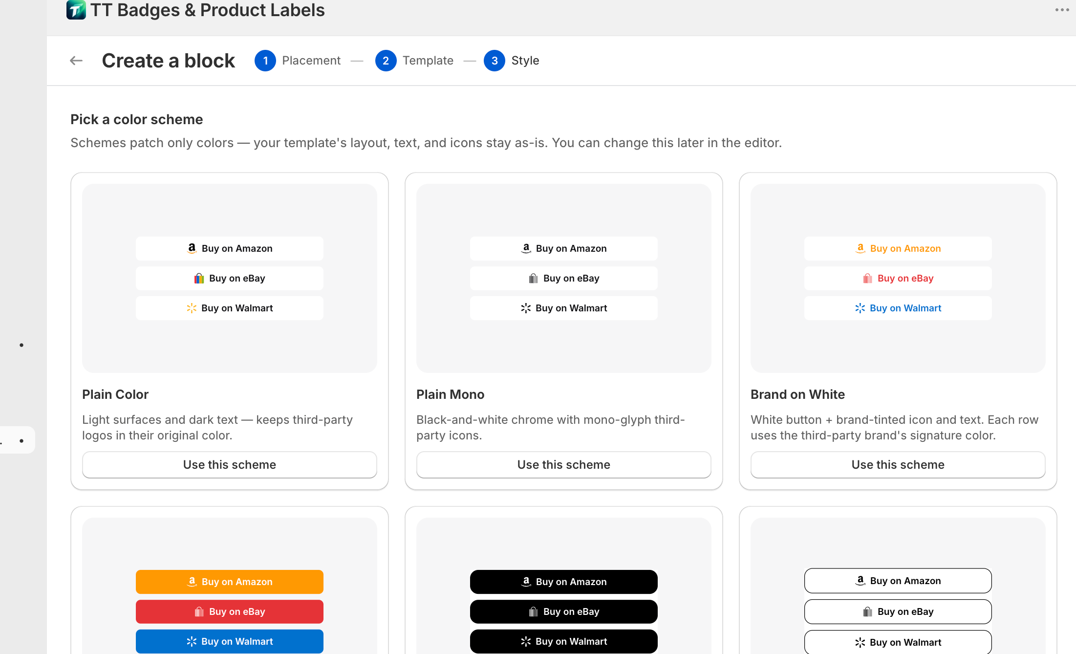
Step 3 — Style
Section titled “Step 3 — Style”Subtitle: “Pick a color scheme”.
Tip: “Schemes patch only colors — your template’s layout, text, and icons stay as-is. You can change this later in the editor.”
A 4-column “Style” picker with internal presets and (if theme supports) “From your theme” group.
Built-in 4 presets:
- Plain Color — “Light bg + dark text — third-party icons keep brand color.”
- Plain Mono — “Pure black & white chrome — third-party icons in mono.”
- Brand on White — “White-bg buttons + brand color icon and text. Each row uses the third-party brand’s color.”
- Brand Fill — “Each button filled with the brand’s color, white text and white mono icon.”
Card with “Default” badge is the default. Click “Use this scheme” to create the block and jump to the editor.
Block type ↔ template enforcement
Section titled “Block type ↔ template enforcement”The wizard enforces compatibility at two layers:
- Manifest filter (frontend) — after picking placement, template list auto-filters to compatible presets
- Server validate (backend) — submission re-validates placement × template compatibility
See Block types for cross-type switching prohibition.