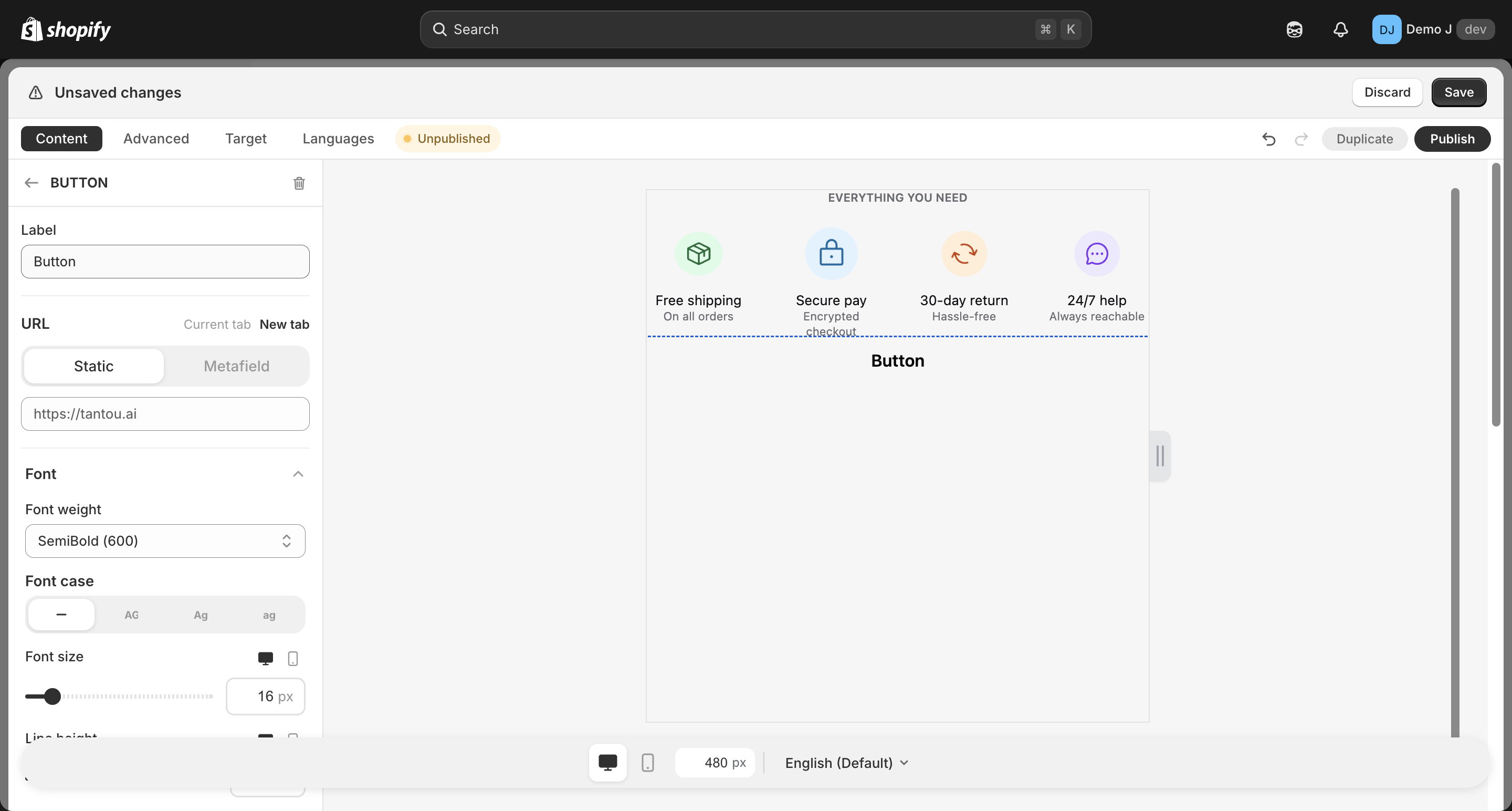
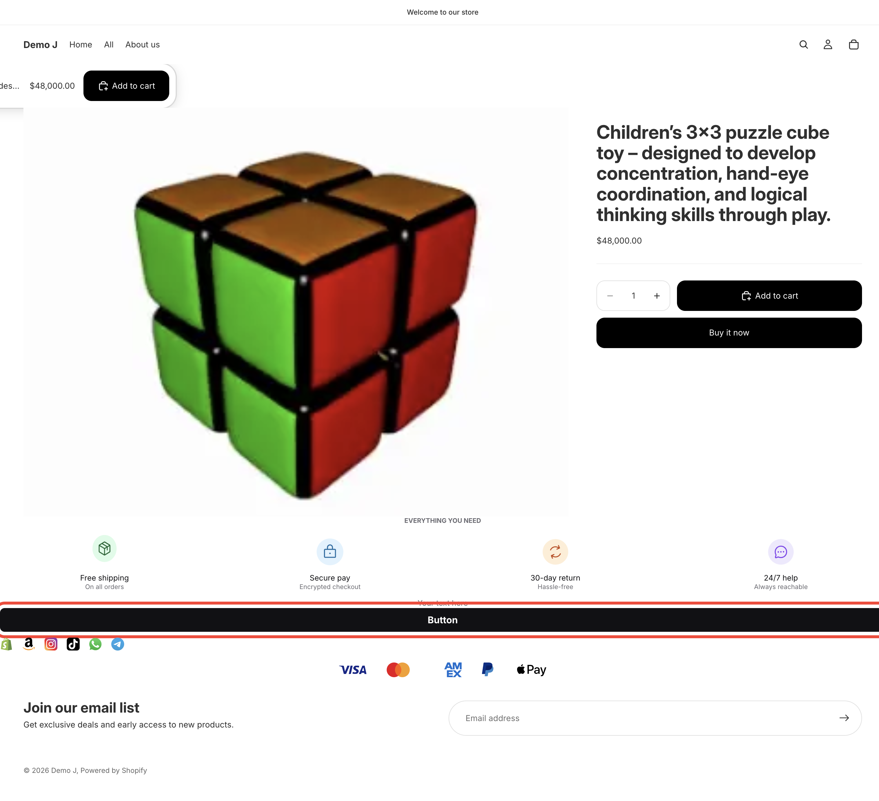
Button
Button (type: button, display name “Button”). Can be used standalone or inside a Button list container.
Fields
Section titled “Fields”- Label (
label) — button text - Font size — responsive desktop / mobile
- Font weight — Regular / Medium / Semibold / Bold / Extra bold / Black
- Text case — Default / Uppercase / Lowercase
- URL type (
url.type):- Static (
static) — direct URL (placeholderhttps://shop.com/...) - Metafield (
metafield) — pick a product metafield namespace; resolves per-product (“Pick a product metafield of type Single line text or URL.”) - Per-product (
products) — multi-product map; resolves by current page product ID
- Static (
- Target (
target): Same tab / New tab
- Background — Fill type (solid / gradient / tricolor / pattern)
- Text color
- Border — color / opacity / width
- Radius
- Padding — responsive
{mobile, desktop}
Icon (toggle)
Section titled “Icon (toggle)”- Icon picker (Icons / Brand / Payment / Shapes / URL)
- Icon position (left / right)
- Icon-text gap
- Icon size
Animation
Section titled “Animation”- Hover animation — multiple presets
- Button animation (nudge) — sustained attention animation
Three button preset categories
Section titled “Three button preset categories”i18n classifies built-in presets into three categories — merchants can one-click select in the wizard / editor:
Shop (buttonPreset.cat.shop)
Section titled “Shop (buttonPreset.cat.shop)”- Buy on Amazon / Buy on Aliexpress / Buy on Ebay / Buy on Etsy / Buy on Rakuten / Buy on Walmart / Buy on Yahoo! Shopping
Social
Section titled “Social”- Facebook / Instagram / TikTok / X / YouTube
Communication (buttonPreset.cat.communication)
Section titled “Communication (buttonPreset.cat.communication)”- Email / WhatsApp / Messenger / Telegram / LINE / WeChat / KakaoTalk
Each preset comes with the corresponding brand’s icon (color / mono variants) and default styling. After selecting a preset, the merchant can continue to edit text, link, etc.
Relationship to button-list
Section titled “Relationship to button-list”button can be used as a top-level component, or as a child of Button list (button_list) container, where multiple buttons share unified layout and styling.