Target tab
The “Target” tab uses 8 independent visibility dimensions to decide whether the block renders. All dimensions are AND: every dimension must match for the block to appear.
Subtitle: “Targeting” / “Only show this block when all conditions match.”
SubNav (10 entries)
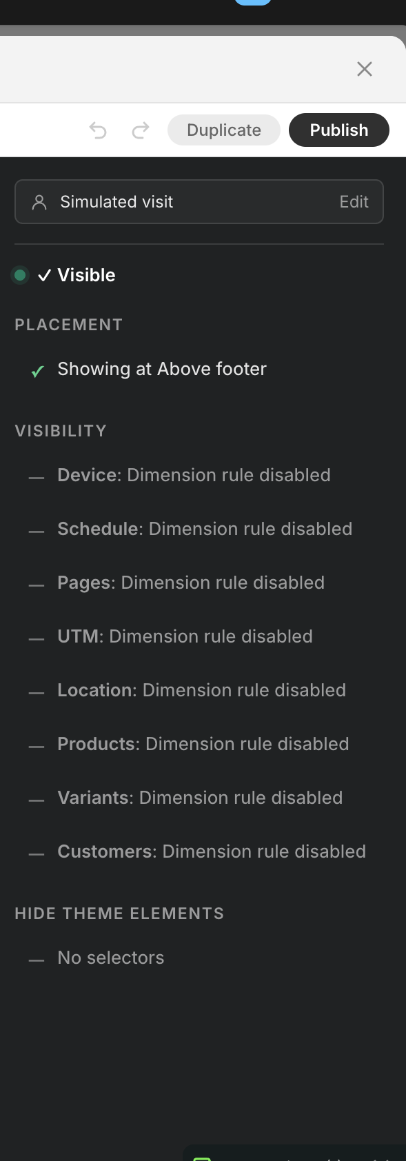
Section titled “SubNav (10 entries)”Left SubNav lists 10 entries: Placement (where it mounts) + 8 visibility dimensions + Hide theme elements (cleanup helper). Visibility dimensions are AND-evaluated; Placement and Hide theme elements are not part of the AND.
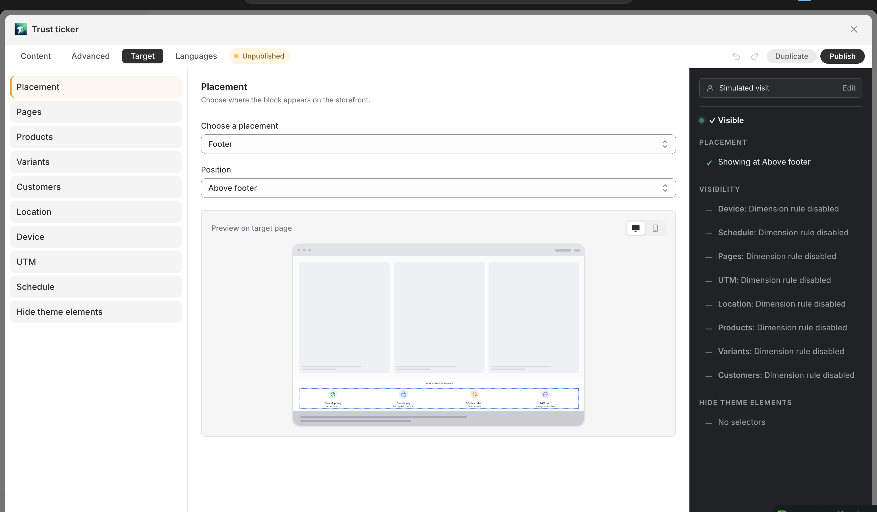
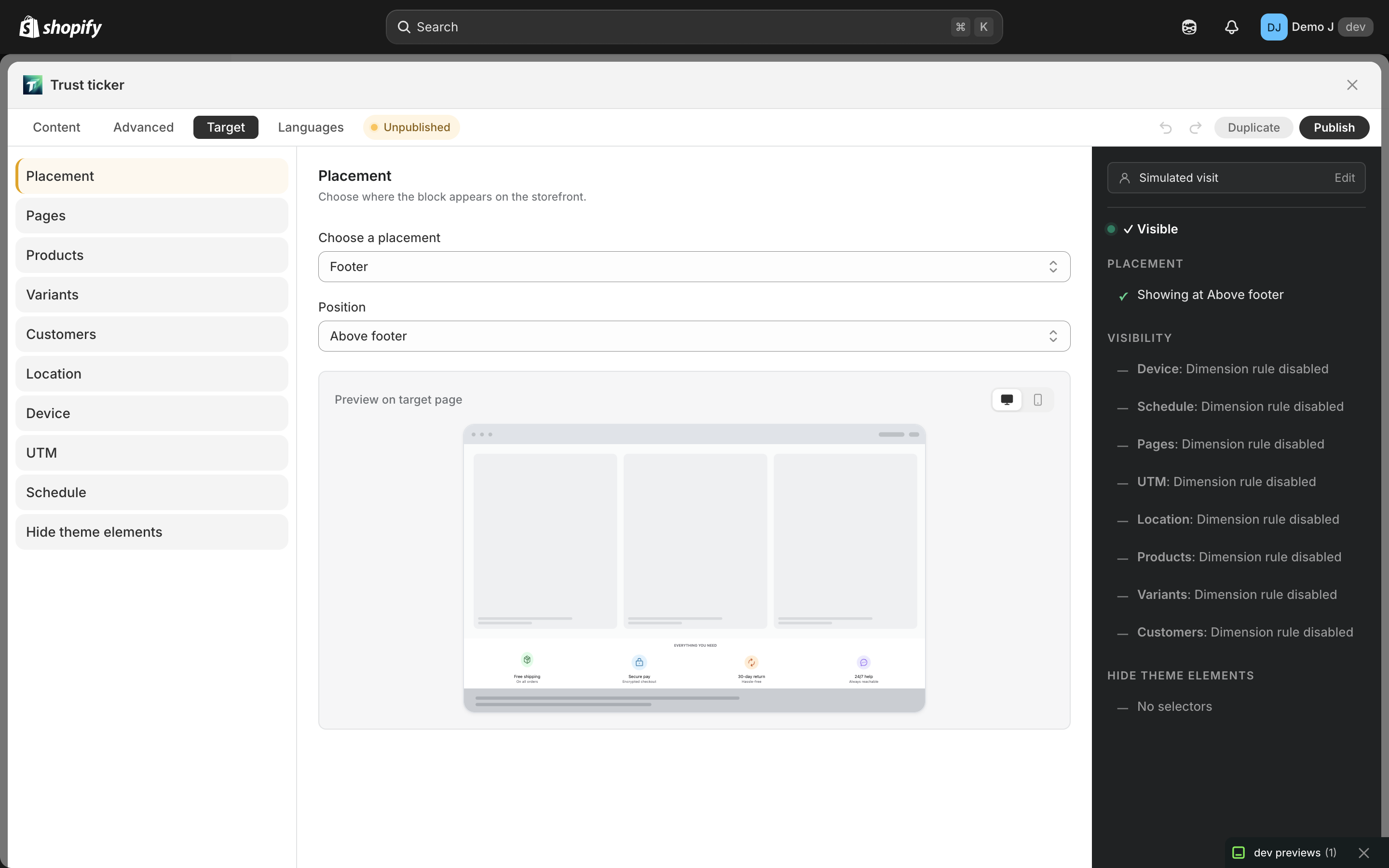
Placement (mount target)
Section titled “Placement (mount target)”Not a visibility rule — it controls where the block mounts, not whether it shows.
- Subtitle: “Choose where the block appears on the storefront.”
- Main dropdown: “Where should this block appear?” (Storefront / Checkout)
- “How is it placed?” (Automatic / Manual (theme block))
- “Position” select (varies by mode) — 7 cards, see Placement modes
- Custom position mode: shows block ID + embed code + “Add to theme” jump
- Checkout tip: “Enable the block in the Shopify checkout editor. Shopify allows at most one checkout block per shop.”
8 visibility dimensions
Section titled “8 visibility dimensions”1. Pages
Section titled “1. Pages”- Subtitle: “Restrict to specific page types.”
- All / Custom toggle
- Custom: checkboxes
- Home (/), Product (/products/…), Collection (/collections/…), Blog (/blogs/…), Article (/blogs/…/…), Cart (/cart), Search (/search), Page (/pages/…), Password (/password), 404
2. Products
Section titled “2. Products”- Subtitle: “Filter by product, collection, tag, vendor, or type.”
- All / Custom toggle
- Products: “Include products” / “Exclude products”
- Collections: “Include collections” / “Exclude collections”
- Type / Vendor / Tags: tag input
- Free tier: max 1 product / 1 collection (demo quota)
3. Variants (Pro)
Section titled “3. Variants (Pro)”- Subtitle: “Match against the currently selected variant — price, inventory, options, or metafields.”
- Specific variants: include / exclude by variant ID
- Variant price range (in store currency)
- Variant inventory stock-status filter
- Option rules — by option name (Color, Size, …) and value
- Variant metafield rules
- Free tier: max 1 variant (demo quota); upgrade prompt: “Upgrade to Pro for unlimited”
4. Customers
Section titled “4. Customers”- Subtitle: “Limit who sees this block based on login status, tags, lifetime spend, or order count.”
- Show to (auth SegmentControl): All visitors / Logged-in customers / Guest visitors
- When “Guest visitors” is selected, customer fields below auto-grey-out
- Tags: tag input (“Add tag…”)
- By lifetime spend: amount range (Include / Exclude)
- By order count: number range (suffix “orders”)
5. Location
Section titled “5. Location”- Subtitle: “Show or hide the block by country.”
- All / Custom toggle
- Countries picker — country code (US / CA / GB) or browse, displays flags + names
6. Device
Section titled “6. Device”- All / Custom toggle
- Device type (SegmentControl): Mobile / Desktop
- OS subset UI removed (evaluator still supports
deviceOs, UI deferred)
7. Schedule
Section titled “7. Schedule”- Start: Now / Specific time (12-hour time picker)
- End: Never / Specific time
- Timezone hint
schedule.enabledderived (no manual toggle needed)
8. UTM (Pro)
Section titled “8. UTM (Pro)”- All / Custom toggle
- Bulk input area (“Browse common” popup: utm_source / utm_medium common values checkboxes)
- Standard UTM rows: source / medium / campaign / term / content (each row Include / Exclude)
- Custom UTM rows: appear after fill, × to delete
- Session persistence: landing-page UTM is stored in sessionStorage; subsequent pages read from sessionStorage as fallback (see UTM targeting)
Hide theme elements (Pro)
Section titled “Hide theme elements (Pro)”Not a visibility rule — it hides existing theme elements when the block mounts (e.g. replacing the theme’s sale tag).
- “Hide theme elements”: multi-line CSS selector input (one per line, e.g.
.announcement-bar/#popup-overlay)
Numeric input tolerance
Section titled “Numeric input tolerance”Range / number inputs across dimensions have unified tolerance:
- min > max auto-swap — reversed input is auto-corrected
- Reject negatives — values can’t be < 0
- step 1 — integer input step
Right Simulator sidebar
Section titled “Right Simulator sidebar”Fill a virtual customer profile to preview rule matches:
- Title: “Simulated visit”
- Subtitle: “Flip these to see how your rules would react. Does not affect the block you save.”
- “URL” (“Paste a real URL: page type, selected variant (?variant=N), and UTM params (utm_source / medium / campaign / …) are parsed automatically. Product pages also fetch live metafields and variants.”, placeholder
https://shop.com/products/foo?utm_source=tiktok) - “Device” (SegmentControl)
- “Auth state” (SegmentControl, customer fields below grey out in Guest mode)
- “Country” (country picker, same as Location dimension)
- “Customer tags” (“Add tag…”)
- “Lifetime spent ({currency})” / “Order count” (suffix “orders”)