Reference
Reference tables for all enums and options — look up as needed.
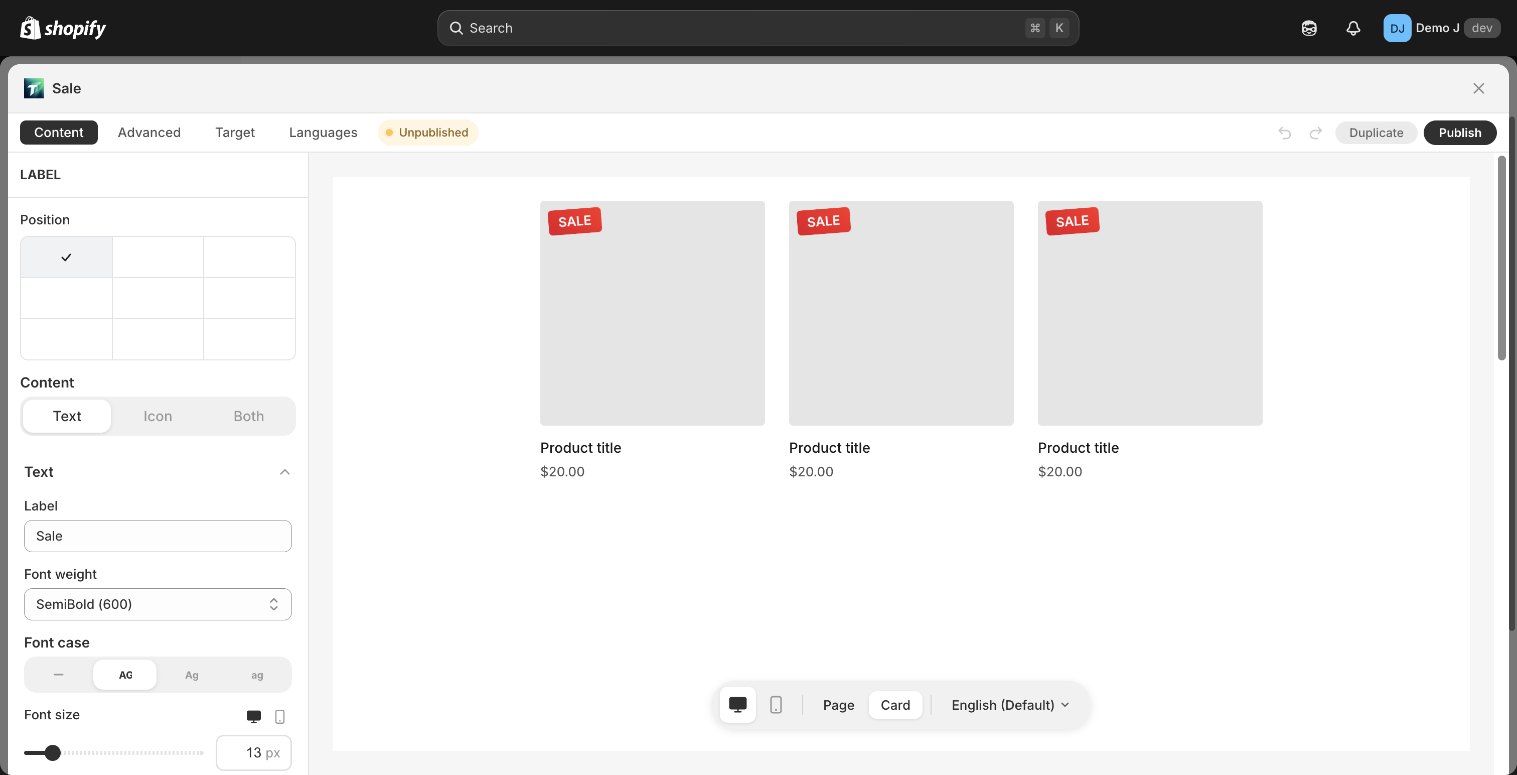
Fill kinds
Section titled “Fill kinds”From i18n fill.kind.*:
- Solid (
solid) - Gradient (
gradient) — Color 1 + Color 2 + Angle - Tricolor (
tricolor) — Color 1 + Color 2 + Color 3 + Angle - Pattern (
pattern) — “Pattern is provided by the color scheme. Switch fill type to solid or gradient to customize.”
Icon library
Section titled “Icon library”Badge / Button list / Coupon icon picker has 5 tabs:
- Icons — generic icon library (Phosphor)
- Brand — filtered by category: E-commerce / Social media / SNS; variants: Color / Mono
- Payment — payment methods (Visa / Mastercard / Amex etc.)
- Shapes — badge shape selector
- URL — custom URL or emoji (placeholder “URL or emoji”)
Icon weights (some icons):
- Regular / Thin / Filled / Duotone
Font weights
Section titled “Font weights”From i18n opt.*:
- Regular / Medium / Semibold / Bold / Extra bold / Black / Off
Border styles
Section titled “Border styles”- Solid / Dashed / Dotted
Alignment
Section titled “Alignment”- Main axis: Start / Center / End / Space between / Space around
- Cross axis: Left / Center / Right / Stretch
- Container width: Fill / Auto
Animation
Section titled “Animation”| Type | Trigger | Applicable components |
|---|---|---|
| Hover animation | Mouse hover | All component types |
| Button animation (nudge) | Sustained attention | Button / Coupon / Button list children |
| Display animation | Block enters viewport | Block container |
| Slide entrance | Label block enters | label_chip |
prefers-reduced-motion system setting → all animations auto-degrade.
Mount anchors
Section titled “Mount anchors”Merchant-selectable 7 cards correspond to 9 + 1 data-layer anchor values.
Main anchor keys:
| Anchor | Type | Merchant card |
|---|---|---|
auto_product | complex | Product page |
auto_cart / auto_cart_drawer | complex | Cart Page / Cart Drawer |
auto_above_footer / auto_below_footer | complex | Footer |
auto_footer | complex (legacy) | — |
float_top / float_bottom / float_left / float_right | floating | Floating Icons |
label | label | Product image overlay |
Full internal anchor list + cascade + 65-theme selector matrix + theme override + customAnchorSelectors: see Anchors and cascade table.
Placement modes
Section titled “Placement modes”placement.mode:
auto— system picks specific DOM position based on thememanual— merchant places via manual block in theme editor
See Placement modes.
Status badges
Section titled “Status badges”From i18n status.*:
- Published / Unpublished / Pending / Error / Custom / Scheduled / Expired / Hidden
Drag / keyboard interactions
Section titled “Drag / keyboard interactions”- List view row drag — mouse-hold the row’s left handle to drag; touch screen long-press then drag
- Editor component drag — Content tab component list row handles
- Shortcuts:
- Cmd / Ctrl + Z — undo
- Cmd / Ctrl + Shift + Z — redo
- Cmd / Ctrl + S — save (some pages support)
- Esc — close dialog / cancel edit
- Keyboard accessibility: all interactive elements support Tab navigation + Enter trigger
Browser support
Section titled “Browser support”| Browser | Min version |
|---|---|
| Chrome | 88+ |
| Safari | 14+ |
| Firefox | 85+ |
| iOS Safari | 14+ |
| Android Chrome | 88+ |
Data retention / limits
Section titled “Data retention / limits”| Item | Behavior |
|---|---|
| Single block config size | 96 KiB hard limit |
| customAnchorSelectors | ≤ 24 per block |
| Block creation count | Unlimited (Free / Pro) |
| Shopify checkout block | ≤ 1 per shop (Shopify platform limit) |
| Stats retention | Last 30 days |
| Deleted block | Immediate deletion (unrecoverable) |
| Uninstall app cleanup | Via app/uninstalled webhook (see Privacy Policy) |